

热门资讯更多>>
- 05-03[网站建设]关于IE6下绝对定位…
- 11-23[网站建设]jquery 做TABS切换…
- 02-13[网站建设]――dopostback缺…
- 07-14[网站优化]如何修改网站标题…
- 11-13[网站建设]SQLSERVER2005 数…
- 09-25[网站建设]屏蔽 Flash 右键的…
- 03-13[网站建设]Windows+ IIS 的手…
- 03-22[网站建设]谈谈如何利用网络…
- 03-04[网站建设]magento整合WORDP…
- 02-07[网站建设]MSSQL备份移植到另…
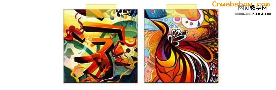
CSS3设计网页制作漂亮的网页图片
| 网页制作cnwebshow文章简介:今天我将重温这个主题然后向你展示使用background-image的方法可以实现多少效果。我将向你展示如何使用box-shadow、border-radius 和 transition 来创作不同的图片风格。 |
译自:CSS3 Image Styles
中文:CSS3图片样式
请尊重版权,转载请注明来源,多谢~~
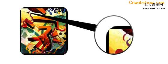
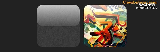
直接在图片元素上直接应用CSS3 inset box-shadow 或 border-radius时,浏览器并不能完美的渲染它们。不过,如果把这个图片用作背景图,你就可以可以给它添加任何样式了,浏览器也会很好地渲染。Darcy Clarke和我做了一个简单的教程,讲解如何使用jQuery来动态地制作完美的圆角图片。今天我将重温这个主题然后向你展示使用background-image的方法可以实现多少效果。我将向你展示如何使用box-shadow、border-radius 和 transition 来创作不同的图片风格。
先看下demo
问题 (见 demo)
看一下demo,请注意在第一行的图片中使用了border-radius和inset box-shadow。Firefox会直接在图片元素上渲染border-radius,但不会渲染inset box-shadow。chrome/safari则两者都不渲染。
解决方案
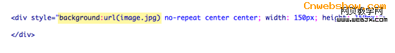
要让 border-radius 和 inset box-shadow 正常工作,解决方案就是将实际图片变作background-image.
动态方法
要想动态实现,可以简单的使用jQuery为每个图片元素外面包一个背景图片。下面的jQuery代码会将所有图片外面包一个span标签然后将图片用作其背景图片(jQuery代码由Darcy Clarke编写)。
12345678910111213 | <script type="text/javascript" src="http://ajax.googleapis.com/ajax/libs/jquery/1.5/jquery.min.js"></script><script type="text/javascript">$(document).ready(function(){ $("img").load(function() { $(this).wrap(function(){ return '<span class="image-wrap ' + $(this).attr('class') + '" style="position:relative; display:inline-block; background:url(' + $(this).attr('src') + ') no-repeat center center; width: ' + $(this).width() + 'px; height: ' + $(this).height() + 'px;" />'; }); $(this).css("opacity","0"); });});</script> |
输出
上面的脚本将会输出下面的HTML代码:
123 | <span class="image-wrap " style="position:relative; display:inline-block; background:url(image.jpg) no-repeat center center; width: 150px; height: 150px;"> <img src="image.jpg" style="opacity: 0;"></span> |
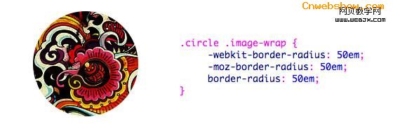
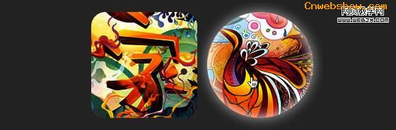
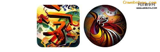
圆形图片(见 demo)
现在,图片被用作背景图了,你可以给它添加任意你想要的样式上去。下面是一个简单的使用border-radius实现的圆形图片。如果你对CSS3不太了解,可以阅读下Basics of CSS3,也可以搜索一下前端观察。
CSS
12345 | .circle .image-wrap { -webkit-border-radius: 50em; -moz-border-radius: 50em; border-radius: 50em;} |
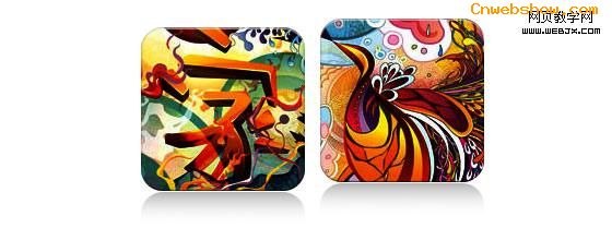
卡片风格(见 demo)
下面是一个像卡片的图片风格,用了多个inset box-shadow。
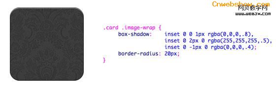
CSS
123456789 | .card .image-wrap { -webkit-box-shadow: inset 0 0 1px rgba(0,0,0,.8), inset 0 2px 0 rgba(255,255,255,.5), inset 0 -1px 0 rgba(0,0,0,.4); -moz-box-shadow: inset 0 0 1px rgba(0,0,0,.8), inset 0 2px 0 rgba(255,255,255,.5), inset 0 -1px 0 rgba(0,0,0,.4); box-shadow: inset 0 0 1px rgba(0,0,0,.8), inset 0 2px 0 rgba(255,255,255,.5), inset 0 -1px 0 rgba(0,0,0,.4); -webkit-border-radius: 20px; -moz-border-radius: 20px; border-radius: 20px;} |
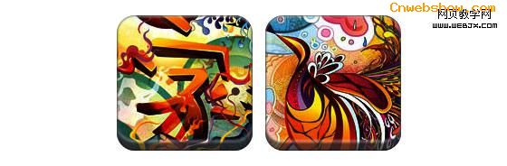
浮雕风格 (见 demo)
通过一点儿改变,我可以将卡片风格转换为浮雕。。。
CSS
123456789 | .embossed .image-wrap { -webkit-box-shadow: inset 0 0 2px rgba(0,0,0,.8), inset 0 2px 0 rgba(255,255,255,.5), inset 0 -7px 0 rgba(0,0,0,.6), inset 0 -9px 0 rgba(255,255,255,.3); -moz-box-shadow: inset 0 0 2px rgba(0,0,0,.8), inset 0 2px 0 rgba(255,255,255,.5), inset 0 -7px 0 rgba(0,0,0,.6), inset 0 -9px 0 rgba(255,255,255,.3); box-shadow: inset 0 0 2px rgba(0,0,0,.8), inset 0 2px 0 rgba(255,255,255,.5), inset 0 -7px 0 rgba(0,0,0,.6), inset 0 -9px 0 rgba(255,255,255,.3); -webkit-border-radius: 20px; -moz-border-radius: 20px; border-radius: 20px;} |
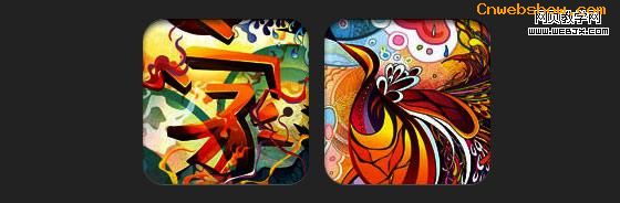
软浮雕风格 (见 demo)
和浮雕风格真的很像,我只是加了1px的虚化~~
CSS
123456789 | .soft-embossed .image-wrap { -webkit-box-shadow: inset 0 0 4px rgba(0,0,0,1), inset 0 2px 1px rgba(255,255,255,.5), inset 0 -9px 2px rgba(0,0,0,.6), inset 0 -12px 2px rgba(255,255,255,.3); -moz-box-shadow: inset 0 0 4px rgba(0,0,0,1), inset 0 2px 1px rgba(255,255,255,.5), inset 0 -9px 2px rgba(0,0,0,.6), inset 0 -12px 2px rgba(255,255,255,.3); box-shadow: inset 0 0 4px rgba(0,0,0,1), inset 0 2px 1px rgba(255,255,255,.5), inset 0 -9px 2px rgba(0,0,0,.6), inset 0 -12px 2px rgba(255,255,255,.3); -webkit-border-radius: 20px; -moz-border-radius: 20px; border-radius: 20px;} |
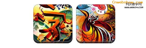
剪贴画风格(见 demo)
同样只是inset box-shadow,我可以让它看起来像剪贴画。
CSS
123456789 | .cut-out .image-wrap { -webkit-box-shadow: 0 1px 0 rgba(255,255,255,.2), inset 0 4px 5px rgba(0,0,0,.6), inset 0 1px 0 rgba(0,0,0,.6); -moz-box-shadow: 0 1px 0 rgba(255,255,255,.2), inset 0 4px 5px rgba(0,0,0,.6), inset 0 1px 0 rgba(0,0,0,.6); box-shadow: 0 1px 0 rgba(255,255,255,.2), inset 0 4px 5px rgba(0,0,0,.6), inset 0 1px 0 rgba(0,0,0,.6); -webkit-border-radius: 20px; -moz-border-radius: 20px; border-radius: 20px;} |
变形和发光 (见 demo)
这个例子中,我为图片外容器增加了变形。mouseover的时候,它将从圆角形状变为圆形,然后增加了发光效果。发光效果通过多重box-shadow实现。
CSS
12345678910111213141516171819 | .morphing-glowing .image-wrap { -webkit-transition: 1s; -moz-transition: 1s; transition: 1s; -webkit-border-radius: 20px; -moz-border-radius: 20px; border-radius: 20px;} .morphing-glowing .image-wrap:hover { -webkit-box-shadow: 0 0 20px rgba(255,255,255,.6), inset 0 0 20px rgba(255,255,255,1); -moz-box-shadow: 0 0 20px rgba(255,255,255,.6), inset 0 0 20px rgba(255,255,255,1); box-shadow: 0 0 20px rgba(255,255,255,.6), inset 0 0 20px rgba(255,255,255,1); -webkit-border-radius: 60em; -moz-border-radius: 60em; border-radius: 60em;} |
发光遮罩 (见 demo)
发光渐变遮罩是通过:after伪元素实现的。。。
CSS
1234567891011121314151617181920212223242526 | .glossy .image-wrap { -webkit-box-shadow: inset 0 -1px 0 rgba(0,0,0,.5); -moz-box-shadow: inset 0 -1px 0 rgba(0,0,0,.5); box-shadow: inset 0 -1px 0 rgba(0,0,0,.5); -webkit-border-radius: 20px; -moz-border-radius: 20px; border-radius: 20px;} .glossy .image-wrap:after { position: absolute; content: ' '; width: 100%; height: 50%; top: 0; left: 0; -webkit-border-radius: 20px; -moz-border-radius: 20px; border-radius: 20px; background: -moz-linear-gradient(top, rgba(255,255,255,0.7) 0%, rgba(255,255,255,.1) 100%); background: -webkit-gradient(linear, left top, left bottom, color-stop(0%,rgba(255,255,255,0.7)), color-stop(100%,rgba(255,255,255,.1))); background: linear-gradient(top, rgba(255,255,255,0.7) 0%,rgba(255,255,255,.1) 100%);} |
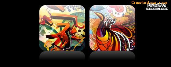
倒影 (见 demo)
这个例子中,我将遮罩渐变移动到底部,于是它就成了倒影。。。
CSS
123456789101112131415161718192021222324 | .reflection .image-wrap:after { position: absolute; content: ' '; width: 100%; height: 30px; bottom: -31px; left: 0; -webkit-border-top-left-radius: 20px; -webkit-border-top-right-radius: 20px; -moz-border-radius-topleft: 20px; -moz-border-radius-topright: 20px; border-top-left-radius: 20px; border-top-right-radius: 20px; background: -moz-linear-gradient(top, rgba(0,0,0,.3) 0%, rgba(255,255,255,0) 100%); background: -webkit-gradient(linear, left top, left bottom, color-stop(0%,rgba(0,0,0,.3)), color-stop(100%,rgba(255,255,255,0))); background: linear-gradient(top, rgba(0,0,0,.3) 0%,rgba(255,255,255,0) 100%);} .reflection .image-wrap:hover { position: relative; top: -8px;} |
光泽和倒影(见 demo)
这个例子中,我同时使用了:before和:after伪元素来实现带倒影的光泽效果。
CSS
1234567891011121314151617181920212223242526272829303132333435363738394041424344454647484950 | .glossy-reflection .image-wrap { -webkit-box-shadow: inset 0 -1px 0 rgba(0,0,0,.5), inset 0 1px 0 rgba(255,255,255,.6); -moz-box-shadow: inset 0 -1px 0 rgba(0,0,0,.5), inset 0 1px 0 rgba(255,255,255,.6); box-shadow: inset 0 -1px 0 rgba(0,0,0,.5), inset 0 1px 0 rgba(255,255,255,.6); -webkit-transition: 1s; -moz-transition: 1s; transition: 1s; -webkit-border-radius: 20px; -moz-border-radius: 20px; border-radius: 20px;} .glossy-reflection .image-wrap:before { position: absolute; content: ' '; width: 100%; height: 50%; top: 0; left: 0; -webkit-border-radius: 20px; -moz-border-radius: 20px; border-radius: 20px; background: -moz-linear-gradient(top, rgba(255,255,255,0.7) 0%, rgba(255,255,255,.1) 100%); background: -webkit-gradient(linear, left top, left bottom, color-stop(0%,rgba(255,255,255,0.7)), color-stop(100%,rgba(255,255,255,.1))); background: linear-gradient(top, rgba(255,255,255,0.7) 0%,rgba(255,255,255,.1) 100%);} .glossy-reflection .image-wrap:after { position: absolute; content: ' '; width: 100%; height: 30px; bottom: -31px; left: 0; -webkit-border-top-left-radius: 20px; -webkit-border-top-right-radius: 20px; -moz-border-radius-topleft: 20px; -moz-border-radius-topright: 20px; border-top-left-radius: 20px; border-top-right-radius: 20px; background: -moz-linear-gradient(top, rgba(230,230,230,.3) 0%, rgba(230,230,230,0) 100%); background: -webkit-gradient(linear, left top, left bottom, color-stop(0%,rgba(230,230,230,.3)), color-stop(100%,rgba(230,230,230,0))); background: linear-gradient(top, rgba(230,230,230,.3) 0%,rgba(230,230,230,0) 100%);} |
胶带风格(见 demo)
这里使用了:after伪元素来在图片顶部实现了胶带风格的渐变。
CSS
123456789101112131415161718192021 | .tape .image-wrap { -webkit-box-shadow: inset 0 0 2px rgba(0,0,0,.7), inset 0 2px 0 rgba(255,255,255,.3), inset 0 -1px 0 rgba(0,0,0,.5), 0 1px 3px rgba(0,0,0,.4); -moz-box-shadow: inset 0 0 2px rgba(0,0,0,.7), inset 0 2px 0 rgba(255,255,255,.3), inset 0 -1px 0 rgba(0,0,0,.5), 0 1px 3px rgba(0,0,0,.4); box-shadow: inset 0 0 2px rgba(0,0,0,.7), inset 0 2px 0 rgba(255,255,255,.3), inset 0 -1px 0 rgba(0,0,0,.5), 0 1px 3px rgba(0,0,0,.4);} .tape .image-wrap:after { position: absolute; content: ' '; width: 60px; height: 25px; top: -10px; left: 50%; margin-left: -30px; border: solid 1px rgba(137,130,48,.2); background: -moz-linear-gradient(top, rgba(254,243,127,.6) 0%, rgba(240,224,54,.6) 100%); background: -webkit-gradient(linear, left top, left bottom, color-stop(0%,rgba(254,243,127,.6)), color-stop(100%,rgba(240,224,54,.6))); background: linear-gradient(top, rgba(254,243,127,.6) 0%,rgba(240,224,54,.6) 100%); -webkit-box-shadow: inset 0 1px 0 rgba(255,255,255,.3), 0 1px 0 rgba(0,0,0,.2);} |
变形和着色 (见 demo)
在下面的这个例子中,我用了 :after元素来在mouseover的时候添加发光渐变。
CSS
1234567891011121314151617181920212223242526272829303132333435363738 | .morphing-tinting .image-wrap { position: relative; -webkit-transition: 1s; -moz-transition: 1s; transition: 1s; -webkit-border-radius: 20px; -moz-border-radius: 20px; border-radius: 20px;} .morphing-tinting .image-wrap:hover { -webkit-border-radius: 30em; -moz-border-radius: 30em; border-radius: 30em;} .morphing-tinting .image-wrap:after { position: absolute; content: ' '; width: 100%; height: 100%; top: 0; left: 0; -webkit-transition: 1s; -moz-transition: 1s; transition: 1s; -webkit-border-radius: 30em; -moz-border-radius: 30em; border-radius: 30em;}.morphing-tinting .image-wrap:hover:after { background: -webkit-gradient(radial, 50% 50%, 40, 50% 50%, 80, from(rgba(0,0,0,0)), to(rgba(0,0,0,1))); background: -moz-radial-gradient(50% 50%, circle, rgba(0,0,0,0) 40px, rgba(0,0,0,1) 80px);} |
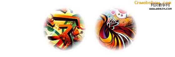
羽化边缘的圆形(见demo)
发散渐变也可以用作遮罩层来实现圆形羽化效果。
CSS
12345678910111213141516171819 | .feather .image-wrap { position: relative; -webkit-border-radius: 30em; -moz-border-radius: 30em; border-radius: 30em;} .feather .image-wrap:after { position: absolute; content: ' '; width: 100%; height: 100%; top: 0; left: 0; background: -webkit-gradient(radial, 50% 50%, 50, 50% 50%, 70, from(rgba(255,255,255,0)), to(rgba(255,255,255,1))); background: -moz-radial-gradient(50% 50%, circle, rgba(255,255,255,0) 50px, rgba(255,255,255,1) 70px);} |
浏览器支持
本文的方法可以在支持border-radius、box-shadow、:before和:after伪元素的浏览器上,比如Chrome/Safari/Firefox等,而在一些落后的浏览器比如IE9(包括IE9)则不能完全支持——IE6/7/8没有任何表现,IE9会有普通的圆角。
发挥你的创造力
正如你看到的,你几乎可以使用:before和:after伪元素实现任何效果。如果你有用CSS3实现更多的创意图片效果,欢迎通过评论与大家分享。
PS,本文中使用:before/:after来实现伪元素,其实我更建议使用双冒号来实现,虽然单冒号有更多的浏览器支持,但是对于这些CSS3实现的效果来说,双冒号更安全一些。
